The psychology of colour is a hidden tool in the world of marketing and advertising. Using this knowledge in the right way can help visitors to your website stick around for longer and follow your highly planned out CTA (Call To Action) – this is the golden ticket to elevated user experience that will not hurt your bottom.
The solutions to targeting the right attitudes and emotions lies in the spectrum of colour that our brains react differently to. The experienced graphic designers and developers in our team at 4Sight are well versed in the psychology of colour and instil their knowledge into every website they design. Here are a few colours that pop out in our strategic planning of a great website.
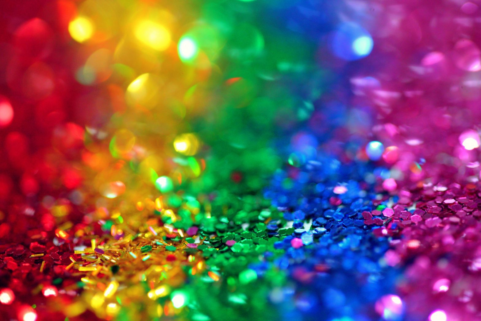
What do colors mean on websites?
While every colour serves a purpose and holds a specific role in the way people react to them, there are a few colours you should be dipping your virtual paintbrush into. Here are the top contenders and where they’re used:
- Blue: this shade creates a sense of trust and should be used by high-stake institutions.
- White: a solid colour used on landing pages to create freedom, explorability and fluidity.
- Black: a luxury colour that presents the idea of value and quality; this would generally be used on landing pages.
- Orange: a colour that encourages haste and timely action, best used on banners or special offers.
- Yellow: a warning denoter that builds up suspense; this is often used in logos for instant recognition
Research documented in 2011 by Xerox Corporation and International Communications concluded that statistically;
- 92% in their study believe that impressive quality was a characteristic increased by colour
- 90% feel that new customers are attracted by colours
- 90% believe colour and memory work together; making documents easier to remember when colour is used
- 83% find colour makes their company appear to be more successful than it is
- 81% believe that finding the right colour choices can give them the edge over their competition
- 76% find that the right colour scheme can make their company look larger in their client’s eyes.
What emotion does each color represent?
Emotions can be toyed with every, single day, by every single outward factor – your website should create the best effect with every user; it’s all about proper strategy and planning!
If your brand’s target market is predominantly made up of male visitors, the best colours to opt for are:
- Blue: this allows them to feel secure
- Green: this gives them a sense of nature’s comfort
- Black: this makes them feel powerful and builds on self-image
The worst colours to go for, if you’re dealing with a male powered market are brown, orange and purple.
Women fuelled markets would prefer to see colour schemes that target shades of:
- Blue: security plays a big role here
- Purple: for the serenity and friendliness
- Green: for a natural and eco-conscious effect.
The worst colours to choose if you are targeting women as your major audience include, orange, brown and grey.
The similarities between men and women’s likes and dislikes are pretty similar; so our take away from this is that both men and women respond well to blue and green and neither of them react well to brown or orange.
Touches of orange are not frowned upon in the world of graphic design though; advert banners are most recognisable when they are presented in hues of orange. Just keep it to a minimum.
What is the most trustworthy color?
The number one goal for every brand, big or small is for your clients, actual or potential to feel safe while they are visiting your website. As we briefly mentioned earlier; blue is the most trustworthy colour.
Blue is a common colour to most of our markets, we see blue in the sea, sky and in our daily life wherever authority is involved. Police Officers generally wear blue uniforms; their importance in society, although not always valued, is one that keeps things in order. And people like order.
Another industry that makes use of blue as a primary colour in their colour palette is the financial sector. This sector is one that requires a whole lot of trust, no user is going to invest their money into a bank that they do not trust.
So which colours should I choose for my brand?
Well, this is where the experts need to give you their 2 cents on the matter. Every brand is different, while classifying between male and female target markets, ages, orientation, religion and other key distinguishing factors also need to be taken into account.
The experts at 4Sight are equipped with vast samples in their portfolio to help guide you towards your company’s ultimate success. This is a challenge, but also a fun task for our designers on the team; their ultimate goal is to present your brand in the best light and to equip it with the best tools or tactics necessary to reach success in the competitive market.
If you’re looking to give your brand a competitive boost; contact our design team today to get the conversation started.